Eclectic Style with the Emporium Collection
An eye-catching and striking choice of geometric designs from Wemyss Fabrics
If you’re someone who enjoys creating an eclectic interiors look, that incorporates striking rich colours and a mix of different geometric fabric patterns, then the Emporium collection from Wemyss Fabrics might just be the perfect choice for your home.
With 40 different colourways, and printed on a rich multi-purpose velvet, the opportunity to choose bold, contrasting patterns is a real feature of this collection. Whether you prefer rich brass and mustard tones against deep greens or a more contemporary grey and pastel toned palette, the exciting mix of designs that encapsulates Emporium is suitable for all end uses. This means you can coordinate fabrics which will work seamlessly together across your upholstery, drapery and cushions and the overall feel will be cohesive whilst still delivering a look which is varied and diverse.
Deep Greens and Moody Mustards
Combining Whitecross in Jungle, and Greenwich in Leaf will form a scheme which gives a nod to Victorian flora and fauna designs. The overall vibe feels geometric in nature and will sit happily against a mix of antique and more contemporary furniture. Upholstering a dark wood footstool in Greenwich Leaf as shown here, would contrast suitably against an Edwardian chaise in the Whitecross Jungle fabric. This would allow you to play with drapery that combines Columbia in the plain mustard shade against simple blinds in Exmouth Nautical.
Whitecross in Jungle combined with the plain Columbia in Mustard, Greenwich in Leaf and Exmouth in Nautical
With so much pattern from these fabrics, we’d recommend keeping walls and floors relatively simple. Colours like Caraway Green or Oxney Olive from Sanderson Paints (also available here from Soft Options Interiors), will bring a harmonious blend together from the more mustard and deeper green shades in these fabrics, whilst still feeling vibrant, whereas White Willow and Oriental Pearl will evoke a cooler toned green backdrop for these fabrics to take centre stage.
Russet Red and Burnt Orange
Whilst the above scheme is perfect for a main living room area, the Emporium collection is flexible enough to provide colourways and mixes which will make for a more interesting kitchen and dining experience. Often fabrics can be forgotten when it comes to our kitchen areas, but if you’ve got an open plan space that needs to move across from eating and entertaining to cooking and preparation, then this collection will help you bridge the gap.
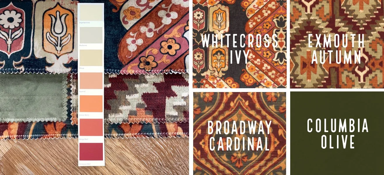
By taking Whitecross in Ivy and combining it alongside Exmouth in Autumn, with their warm russet red and burnt orange tones, you will be able to upholster dining chairs, along with any surrounding occasional use dining room sofas and chairs to make everything come together and feel suitably snug and cosy. Painting your dining area in a shade like Ampuri Red will capitalise on this cosiness, whilst then allowing you to move onto a more muted, yet still warm wall area palette in the kitchen area using a colour like Mudstone or Wheat.
A great transitional scheme to lead across from a dining to kitchen area with classic Limed Oak flooring
Upholstering barstools in Broadway Cardinal, if you have a breakfast area which leads on from the main dining zone into the kitchen will bring a movement of complementary colour across everything. If you’d prefer to transition into something more subtle then the plain velvet Columbia Olive shade could be used for your upholstery elements here instead, or would be a great shade to colour match to paint for wooden kitchen cupboards.
Classic Limed Oak from Kardean Flooring, on display in our showroom and featured above, offers the perfect combination of warmth and neutrality against this collection, as well as being immensely practical and hardwearing. Introducing rugs in rich jewel toned greens would also be another great layer of texture to bring in.
Go for Greige and Graphite
If you love the idea of the Emporium collection, but want to go for a cooler, contemporary look and feel in a more modern interiors setting, then opt for Portobello in Petal along with Exmouth in Rosewood as a great alternative option. This would work equally well in a dining to kitchen or bedroom setting.
A contemporary look and feel for a more modern interiors setting
Greige Light from Sanderson Paints is a feathery and fresh neutral tone which encapsulates the warmer colours within these fabric options whilst bringing in the plain velvet Graphite Columbia alongside a darker Graphite paint shade offers a nice balance between masculine and feminine. White Washed Oak from Kardean Flooring would introduce a minimal texture that helps to balance light and space throughout.


