Creative Colour and Harmony with Harlequin
Design vibrant schemes with the new range of fabrics and wallpapers from the Harlequin 2 collection
Harlequin from Sanderson Design Group has a belief that the best interiors are created when they truly reflect who we are. Bold, colourful and unapologetically individual, Harlequin work with a philosophy that developing your emotional understanding to colour enables you to design an interior look that innately expresses your own individuality and positively impacts your overall mood.
As Harlequin say it’s all about ‘Owning the Room’ in a way that makes you feel fantastic. This is why the new Harlequin 2 collection of fabrics and wallpapers for Spring 2022 introduces a range of bold and colourful prints, embroideries and weaves which explore dramatic patterns and colourways with four signature looks named ‘Rewild, Retreat, Reflect and Renew’ which all delve into an aesthetic that brings in global design and influences to feel far reaching and adventurous.
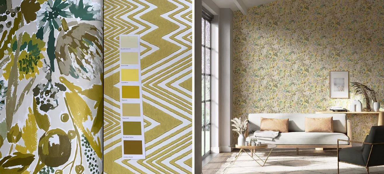
Loose florals in sunny colours
If you’re looking to design a scheme which feels vibrant and fresh then Sanguine with its yellow and green colourway, offers contemporary tones in mustard and teal hues which are bright and stimulating whilst also feeling subtle and painterly through impressionistic strokes.
Combining this with the geometric lines of Ankara creates a bold juxtaposition which will really give an eclectic twist to the floral nature of Sanguine. Perfect as a transition scheme if your hallway opens into your main living area, Ankara when paired with a paint colour like Desert Gold from Sanderson will offer a striking, sunny entrance look. Keeping fabrics and carpeting neutral will ensure this scheme feels sophisticated and elegant.
Bold blues and greens
The theme of nature continues for Harlequin 2 with the Peonia fabric in the Azurite, Meadow and Nectar colourway, which would be a delightful choice to upholster a statement sofa or chair. The delicate peony blooms are large scale enough to feel substantial without the risk of being overwhelming. A contrasting stripe on other upholstery or curtains like Calla will give this scheme a ‘beachy West Hamptons’ vibe with a satin weave which gives subtle movement. Rewilded offers a gorgeous ombre of colour which could be introduced sparingly on an antique footstool or take centre stage on blinds.
A curtain pole and finial like Claremont in Baroque Gold featured here will make this scheme feel more traditional and introducing a colour like Newby Green with its masculine teal tones will elevate the wow factor even more.
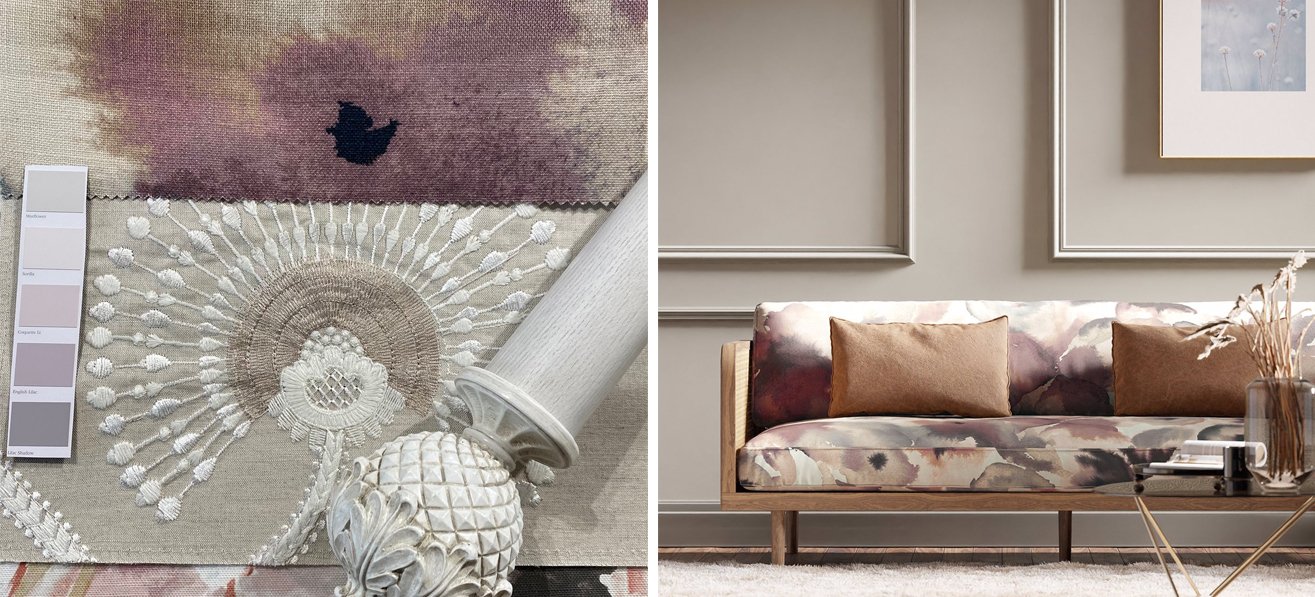
Moody mauves and lovely lilacs
Flores is a ‘contemporary overblown abstract interpretation of watercolour flower-heads’ and in the Damson, Viola and Blush colourway we feel it offers an elegant backdrop for any scheme where you want to create an air of calm and relaxation. The gorgeous embroidery of Louella is subtly highlighted through the use of metallic yarns and subtle colourways. We would recommend keeping things neutral against Flores in the Rose Quartz and Pearl option for Louella.
If you want to amp up the floral factor then Helianthus would compliment these two fabrics perfectly and finish off the dreamy peacefulness of this scheme. Walls in a soft shade like Mistflower from Sanderson Paints will help keep everything restful whereas Lilac Shadow with its French Grey undertone will increase the moodiness of the atmosphere. Light woods with pale washes like the Botanical Pole and Finial featured here in Parchment White also adds to the airy and fresh feeling.
Whatever your own individual taste and approach to colour might be, the beauty of the Harlequin 2 range is its ability to be dialled down or amped up to fully reflect your own individual interpretation. We’ll be bringing you more options from this unique collection in the future.
All images in this post are courtesy of Harlequin


